
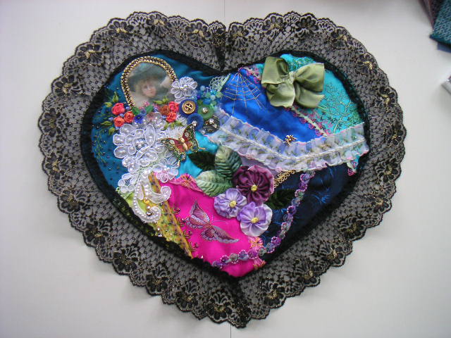
ペアのハートクッションカバーは昨年のバッグチャレンジのときに私が、フロリダのスー・デュフィさんのバッグから作ったものです。布を見たとき、どういう配色にするかとても迷いました。入っていたリボンやビーズなどの装飾用の材料の色のこともあり、結局写真のように仕上げました。配色は、昨日の韓国のお人形の衣装によく似ています。
ターコイズとローズピンクの組み合わせは日本にもありますが、そこに原色に近い黄色やオレンジ、黄緑を加えるというのが日本にはないところです。落ち着かない気持ちで送り返したのですが、スーはとても喜んでくれました。材料が本人の好みで選んでありますから、一生懸命作ってさえあれば、大体は気に入った作品になるということなのでしょう。


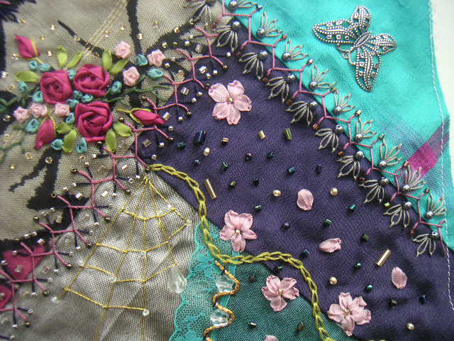
今年、似た配色でキルトを作りました。その中のブロック2枚です。銘仙の和布と帯地を使ってあります。配色のパターンは、ある意味で万国共通なことがわかります。しかし、それぞれの布を見ると、全体をまとめる地色に使われているのはグレーと紺です。私もシームのステッチにはグレーと紺、グレーがかった地味なピンクと黄色を使いました。ビーズもほとんど、無彩色のグラス、メタル、パールのみです。写真でのちょっと見だと、クッションと大差なく見えるかもしれませんが、この辺に東西の違いがあります。
ところでそれぞれのブロックのクローズアップですが、どちらも自分で作ったものですが、私は、最初の方の、夜桜という感じが好きです。ところがフリッカーのアルバムで、海外の人が開いてくれるのは圧倒的に二番目で、夜桜にはあまり見向いてくれません。

When we had a baggie challenge as the first, I made a pair of heart cushion covers for Sue Duffy in Florida. You can see I added yellow, orange and light green to the basic color combination of turquoise & rose pink. I chose them from her baggie. Don't you think whole combination is very similar to the wears of Korean dolls clothes?
In May I made a CQ, using Japanese fabrics. The basic color combination is also turquoise and rose. But the third color which unites the whole is gray/navy blue here. Then I used gray, navy, grayish pink and grayish yellow threads for seams,and added only monotone glass, metalic and pearl beads.
Here are two close ups of the blocks. Which do you prefer? I myself do the first one. But the second one has been hitted much more times in flickr albumn.
I am thinking the national color preference/color sense might be related to the nature or scenic condition in its own country.
2 comments:
I love the colors! The cushion covers are wonderful!
I, too, like the top one more, but I think the colorful ribbon on the bottom block probably prompts a lot of people to click on it and see what that's about.
Post a Comment