ラウンドロビンをいくつか経験して、日本人と海外の人では微妙に色彩感覚が違うと感じたことにちょっと触れたら、もっと聞きたいというコメントが複数あったので、それについて自分でも考えてみることにしました。一回ではすまないと思いますが。
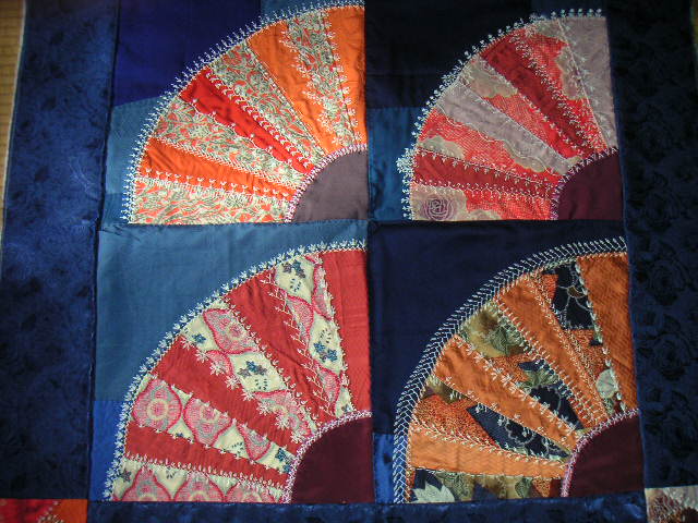
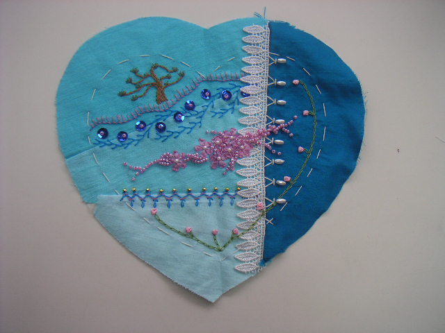
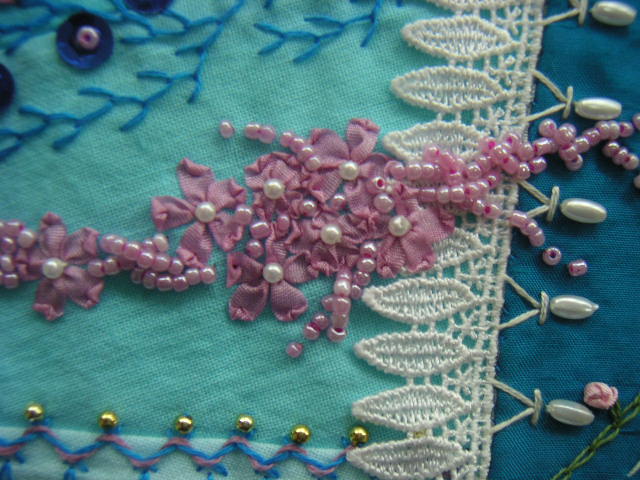
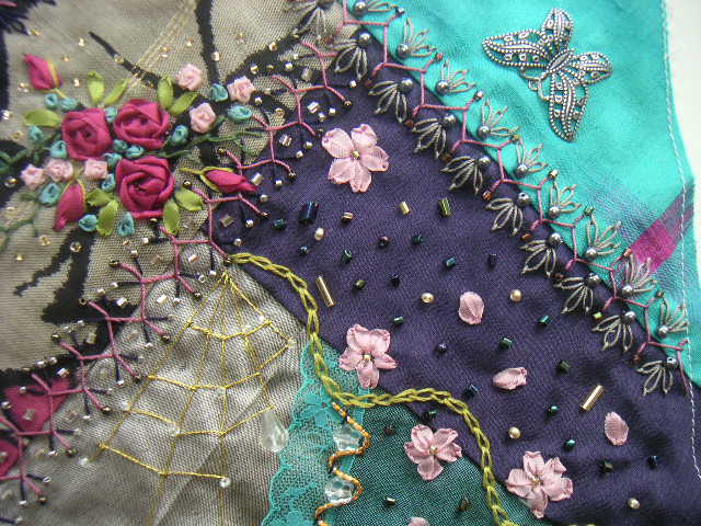
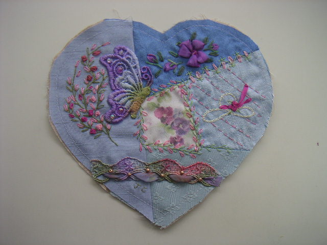
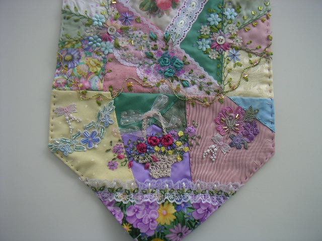
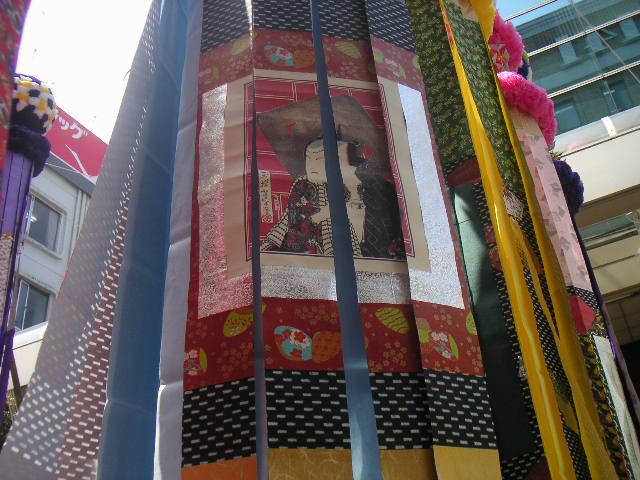
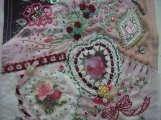
デビーさんがブログで、3年前 CQ Newsletter が主催したコンテストのために作った、”薔薇とリボン”のブロックの装飾について、書いていました。美しいブロックでさすが、と感心して読んで(見て?)いたのですが、実は私もこれに挑戦していました。刺繍用の糸とリボン、ビーズ、モール糸、薔薇のモチーフなど、用意された装飾用セットを購入し、布は自分のものを使い、”薔薇とリボン”のテーマでブロックを作るというものでした。海外の材料を使った初めての経験でしたが、そのセットが届いたときの、ショックに近かった気持ちは今も憶えています。あまりにも派手な色合いで、自分に扱えるだろうかという戸惑いでした。深紅ではなく薄い方の薔薇色ですが、糸、リボン、ビーズ、モールと、メーンカラーが、自分では到底選ばない色だったからです。(この自分では到底選ばない色というのを、アメリカの人たちは普通に使うのです。デビーさんのように、真似はできないけれど美しいと思える人は沢山いますが。)布に薄い色を使い、できるだけ色を抑える形で仕上げたのが写真です。浮き上がらせたくない、というのが基本姿勢だったと思います。自分で思うよりは評価されて(あるいは日本人が珍しかったせいか)、次号で他の何点かと一緒に優秀作品として紹介されました。
色のことを考えると、私には配色や色合い、色の量のバランスが嫌いということはあっても、単独で嫌いな色は特別ないように思います。この薔薇色ピンクもメーンでなくアクセントカラーとしてなら、自分でも使うかもしれません。

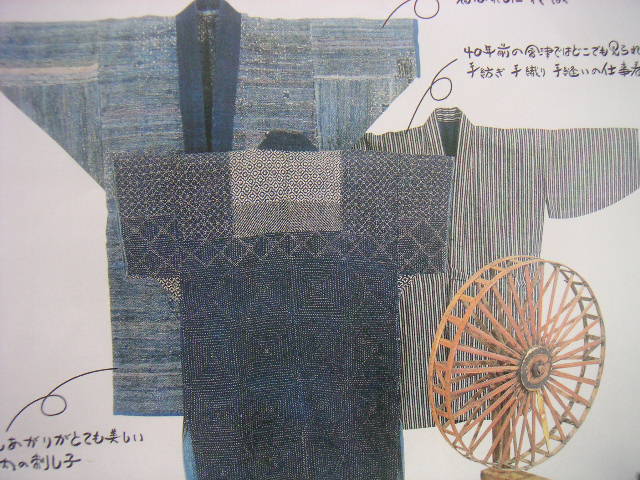
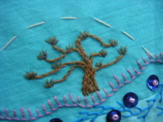
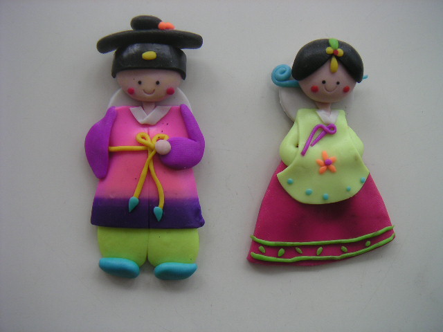
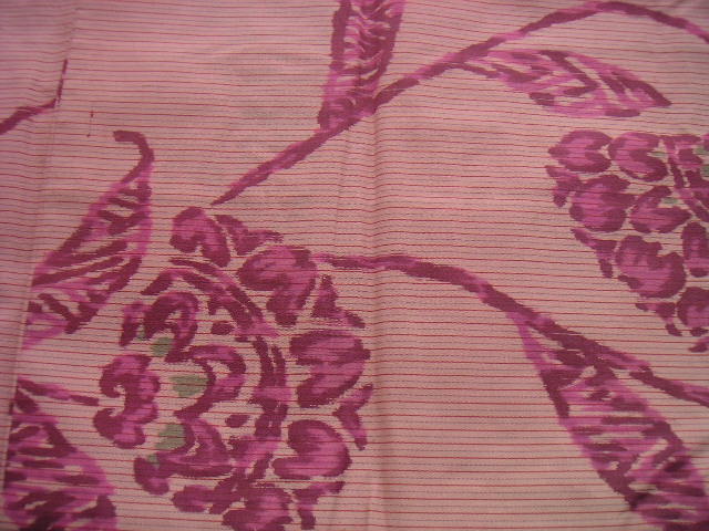
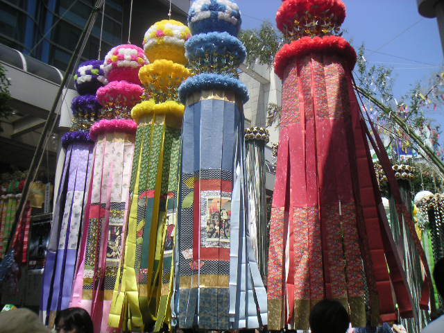
小さなお人形は韓国の人からのおみやげです。マグネットで冷蔵庫に止めていますが可愛らしくて好きです。しかし、実際にこの配色の衣装を着ることを、日本人は想像もつきませんが、韓国の人は着るのでしょう。布の写真は、私の持っている銘仙の和布です。「薔薇とリボン」ブロックの配色に似ています。日本人も同じような配色を選ぶこともあるわけです。ただクローズアップで、私自身気づいたのはグレーです。縞の中にも、花の芯にもグレーが使われています。グレーで少し中間色に近づけ、派手さを抑えるのが日本人の感覚かもしれない、と思いました。


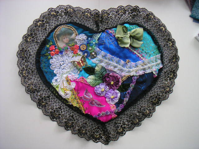
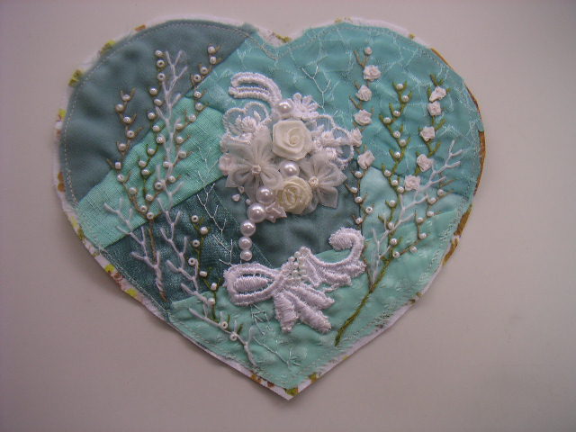
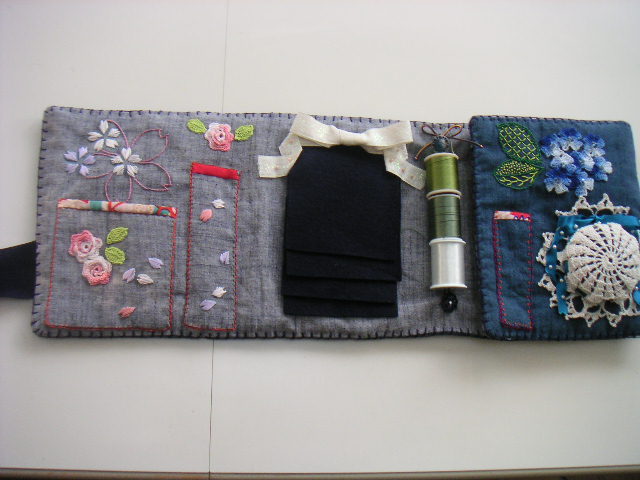
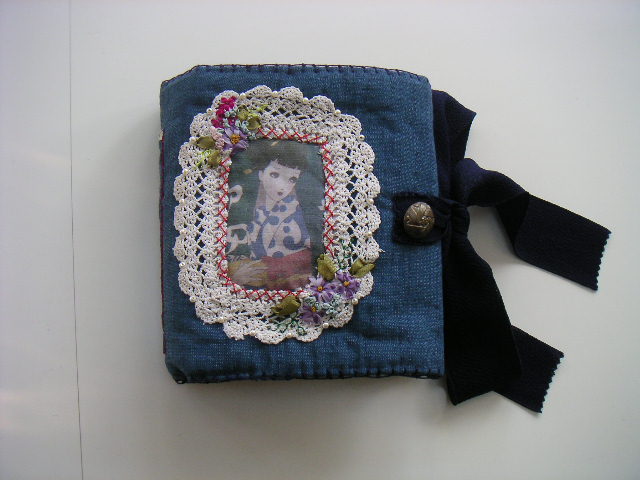
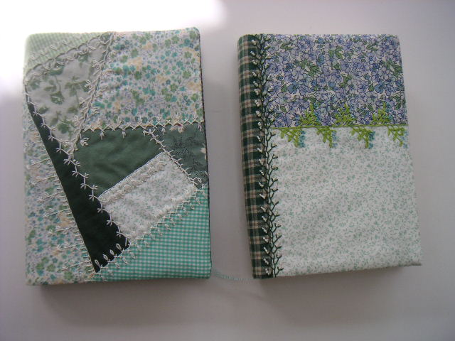
昨年末、ニードルブックにしようと思って、臙脂や深紅を使ったブロックを作りました。昔に比べたら私自身、ずいぶん派手な色も使うようになったと思いますが、今見るとやはり、意識的にか無意識的にか糸にもビーズにもシルバーがたくさん使ってあります。そして少なくとも同系色でまとまっています。韓国の衣装のように黄色を足すなどは、日本人には想像外のことでしょう。

Debbie was writing about her "Roses and Ribbons" block for the CQ Newsletter contest. Her colors are so beautiful and natural. To tell the truth, I had made my own block for the same contest. It was the first experience for me; not only contest but using oversea embellishments as well. When I received and opened the package, I was shocked because the main color of pink seemed to be too vivid and bright for me to handle. I made that pink toned down on the light colored fabrics. I felt it very hard to work but my completed block was not so bad.
I don't think there are certain colors I dislike. There are only color combinations I dislike or I feel uncomfortable with. And when I use the word of combination, that include the balance of quantity of each color, too. As an accent color, I would use any.
Here are small magnet dolls I was given from a Korean as a souvenior. They are very cute and I like to use them on my refrigirater. But I can't imagine to wear in such colors combination myself or use it for even for my CQ block, though Korian people would do. This is the difference between our two nations. Chinese people would use such combination sometimes.
I'll show you the photos of Japanese kimono fabric I have. This is "Meisen" silk, not for formal but casual kimono. The color choice looks very similar to the "Roses and Ribbons" block. But if you look at the close up carefully, you will find gray is used much to soften the vividness. I think this gray might be one of the Japanese colors' key. But this is only my guess.
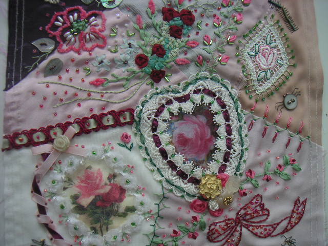
I made a dark red block last year. I had become to pick up showy color more than before, but still I find myself having used silver threads and beads much on this block. I don't know it was consciously or unconsciously.